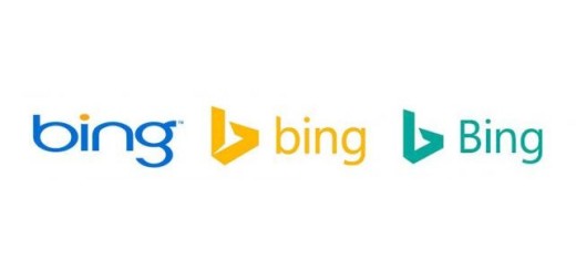

Microsoft has updated the logo for its Bing search engine, seen above on the right. The bright yellow has been replaced by a tame green and switched the ‘b’ to upper case. The abstract ‘bird’ that you’d no doubt noticed in the geometric ‘b’ shape has also lost its tail. Microsoft said it made the change because green “is easier to see over yellow,” but at first glance, it looks a lot less exciting than the last iteration, introduced in September 2013. The redesign comes as the company celebrates the continued success of its search service, which turned a profit for…
This story continues at The Next Web


